Loading blog post...
8 UX Patterns Used By The Best Web3 Websites
In the trust-sensitive landscape of Web3, a website is never "just a website", it is a proof of competence. Most users experience a "trust collapse" when a flashy landing page leads to a confusing, high-friction dApp. This guide breaks down the 8 essential UX patterns used by top-tier Web3 projects to create a seamless journey from the first click to the final on-chain transaction. Learn how to replace hype with "Calm UX" and turn curiosity into long-term user confidence.
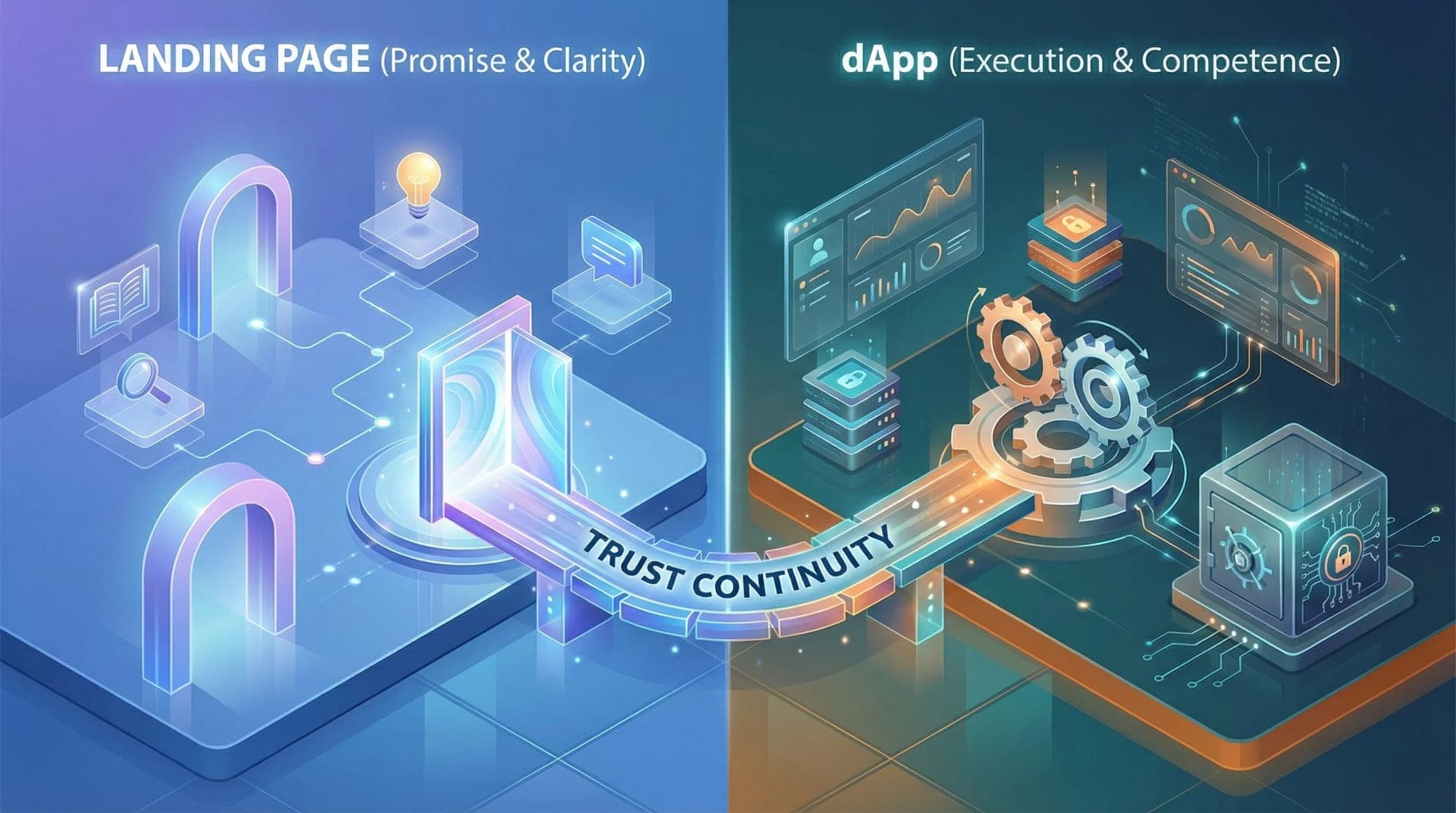
In Web3, a website is never “just a website.” For most users, the landing page is the first trust checkpoint and the dApp is the first proof of competence. Together, they form a single experience. If the landing page overpromises and the dApp underdelivers, trust collapses. If the dApp is powerful but the landing page is unclear, users never reach it.
The best Web3 websites treat landing pages and dApps as two stages of the same UX journey. Both are designed to communicate clarity, maturity and the Web3 product’s intent.
This article breaks down eight UX patterns used by top Web3 websites, showing how web3 user experience works across both web 3.0 landing pages and dApps to convert curiosity into confidence.

1. Web3 Landing Pages That Set Accurate Expectations for the dApp
The most damaging UX mistake in Web3 happens before users even open the dApp: misleading landing pages.
High-quality web3 websites use their landing pages to clearly communicate:
- what the product actually does today
- who it is designed for
- what level of effort or risk is involved
Instead of abstract slogans, the UX aligns messaging, structure, and calls-to-action with the real dApp experience. When users transition from landing page to dApp, nothing feels surprising.
This expectation alignment is a defining trait of top web3 websites and reduces early abandonment significantly.
For teams aligning landing-page UX with real product behavior, contact our Web3 UX design services that focus heavily on expectation-setting.
2. Purpose-Led UX That Connects Web3 Landing Pages to dApp Actions
On weaker web3 sites, landing pages explain features, while dApps expose tools with no narrative connection between them.
The best web 3.0 websites design UX around purpose continuity. The landing page introduces user intent, and the dApp immediately continues that same story through actions.
This pattern shows up as:
- landing-page sections that map directly to dApp sections
- consistent terminology between marketing and interface
- calls-to-action that lead to meaningful first steps
Users never feel like they’ve “entered a different product” when moving from site to dApp.
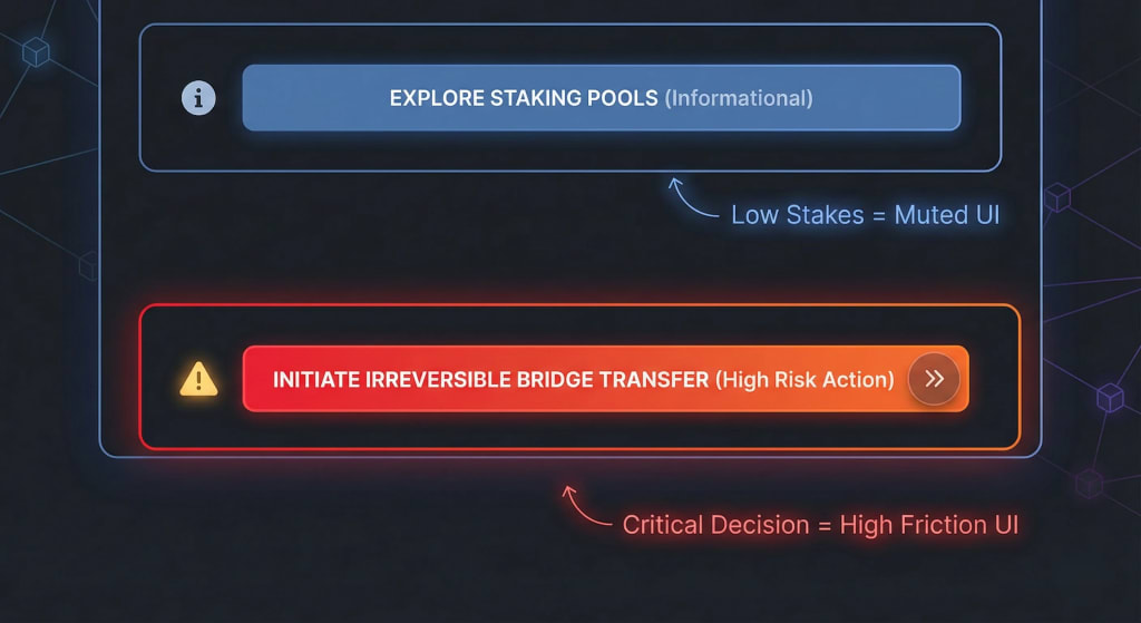
3. Visual Hierarchy That Signals Risk and Importance Across the Entire Web3 Site
In Web3, some actions are informational, some are exploratory, and some are irreversible. Strong web3 UX design makes this obvious across both landing pages and dApps.
The best web3 websites use visual hierarchy to:
- emphasize high-impact actions
- de-emphasize secondary exploration
- clearly separate critical decisions
On landing pages, this prevents overcommitment too early. Inside the dApp, it prevents accidental misuse. This shared hierarchy creates a consistent mental model across the experience.
For teams designing trust-aware interfaces, reach out to EthElite today for a free consultation.
4. Calm UX That Replaces Hype Across Web3 Landing Pages and dApps
In 2026, calm UX is a competitive advantage.
Early web 3.0 sites relied on hype-heavy landing pages and dense dApps. The top web3 websites now do the opposite: both surfaces feel composed, deliberate, and stable.
This calmness appears as:
- restrained motion and animation
- confident, neutral language
- absence of artificial urgency
Landing pages feel credible. dApps feel safe to explore. Together, they signal product maturity.

5. Consistent UX Patterns Between Web3 Sites and dApps Build Confidence
One of the fastest ways to lose trust is inconsistency. When a landing page feels polished but the dApp behaves differently, users hesitate.
The best web3 websites maintain consistency across:
- layout logic
- terminology
- interaction feedback
- visual tone
This consistency reduces cognitive friction and makes the transition from exploration to usage feel natural.
Across top web3 websites, this pattern is a clear marker of serious product teams.
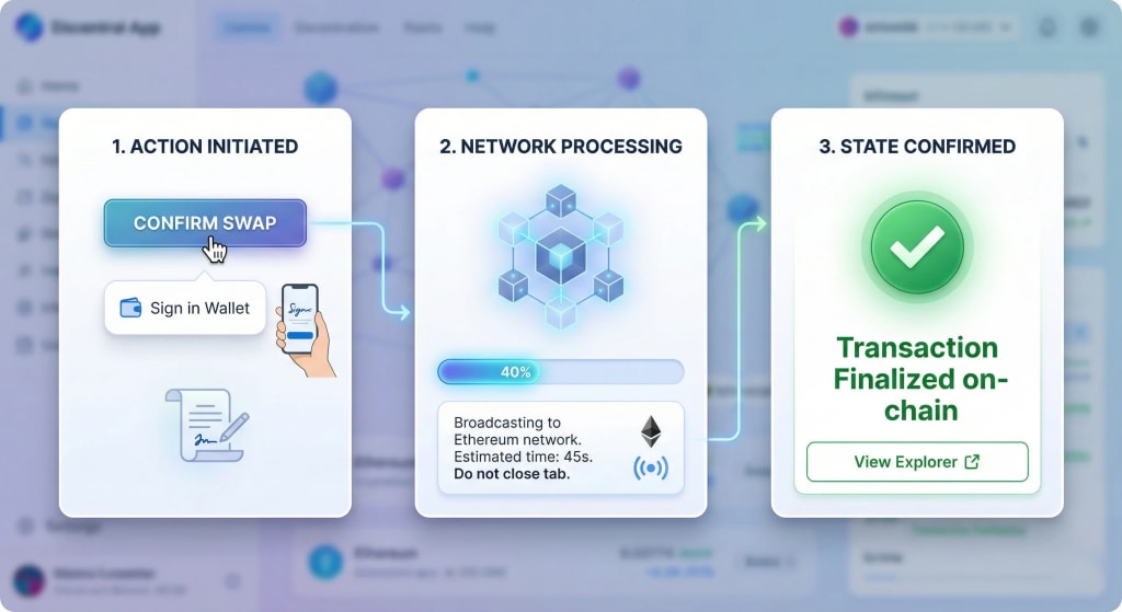
6. State-Aware UX That Explains What’s Happening Without Assuming Knowledge
Landing pages explain what the product is. dApps must explain what the system is doing right now.
Strong web3 user experience design makes system state visible and understandable without assuming blockchain expertise. Users always know:
- whether they can act
- why something is unavailable
- what to expect next
This clarity prevents confusion and reduces support burden across both web3 sites and dApps.
7. Error and Edge-Case UX Designed Across the Full Web3 Website Journey
Errors don’t start in the dApp, they start when expectations are unclear.
The best web3 websites design error UX across the entire journey. Landing pages prepare users for constraints. dApps handle failures gracefully when they occur.
Strong error UX:
- explains limitations early
- preserves user context
- offers recovery paths
This makes the product feel resilient rather than fragile.
8. Orientation-Focused UX That Makes Both Web3 Sites and dApps Feel Navigable
Finally, the defining UX trait of top web3 websites is orientation.
Whether users are on a landing page or deep inside a dApp, they always know:
- where they are
- what the product expects from them
- what happens next
This orientation is achieved through structure, not hand-holding. It’s what turns first-time visitors into long-term users across modern web 3.0 websites.
FAQ: Web3 UX Across Landing Pages and dApps
Q: Do top web3 websites treat landing pages as marketing only?
A: No. They treat them as trust and expectation layers.
Q: What causes UX breaks between site and dApp?
A: Inconsistent messaging, terminology, and interaction logic.
Q: Is calm UX really better than hype for Web3?
A: Yes. Calm UX signals stability and maturity.
Q: Can UX fixes improve adoption without changing protocols?
A: Absolutely. UX strongly shapes perceived reliability.
Conclusion
In Web3, the landing page earns attention, but the dApp earns trust. The best Web3 websites respect this separation while keeping both clear, intentional, and honest.
EthElite focuses on getting each layer right - landing pages that explain the product without noise, and dApps that deliver exactly what was promised.
Strong Web3 user experience doesn’t simplify the product. It makes users feel oriented, informed, and confident at every step. And in an ecosystem where trust is scarce, that confidence is the real differentiator.
Share with your community!